
OVO Charge
Charge Anytime was an app from OVO that let users manage the charging of their EV at home. Bonnet was an app that let drivers charge their cars using public chargers. In 2023, OVO acquired Bonnet, and I led the work to combine both apps into one called OVO Charge. Both apps had tens of thousands of users using the app every day.
Old app (Charge Anytime)

Old app (Bonnet)
The plan was straightforward: rebuild Charge Anytime inside Bonnet. OVO Charge, one app, one design language, two user groups who both had to feel at home in it.
It was not that easy…
Two apps, two tech stacks, and two design systems
Bonnet was native, Swift for iOS and Jetpack Compose for Android. Charge Anytime was React Native. Different design tokens, different colour systems, different information architecture. Nothing translated directly.
I started by mapping both apps in full. Every component, every pattern, every design decision that had been made in isolation across two different stacks. You can't merge what you don't fully understand.
At the same time I ran a depth user research to understand what both user groups actually expected from a combined app. Not what we assumed. What they told us.
From there I updated the design system to reflect the unified product, making sure Charge Anytime features could be delivered quickly without starting from scratch every time.
Different user preferences / usage pattens
While unifying the design language was tough, the biggest challenge came from accommodating two different sets of users who cared about different things. Here are the few examples:
Map
Public users were comfortable with the map. Home users had one ask: don't make me look at a public charger map every time I open the app. So we kept the map, we just stopped leading with it for the wrong people. Public users open to the map. Home users open to the schedule screen. Same four tabs, different order. Small change, big difference.

OVO Charge

OVO Charge
Schedule
For public users this was a bonus. Home charging meant cheaper sessions, nothing to lose.
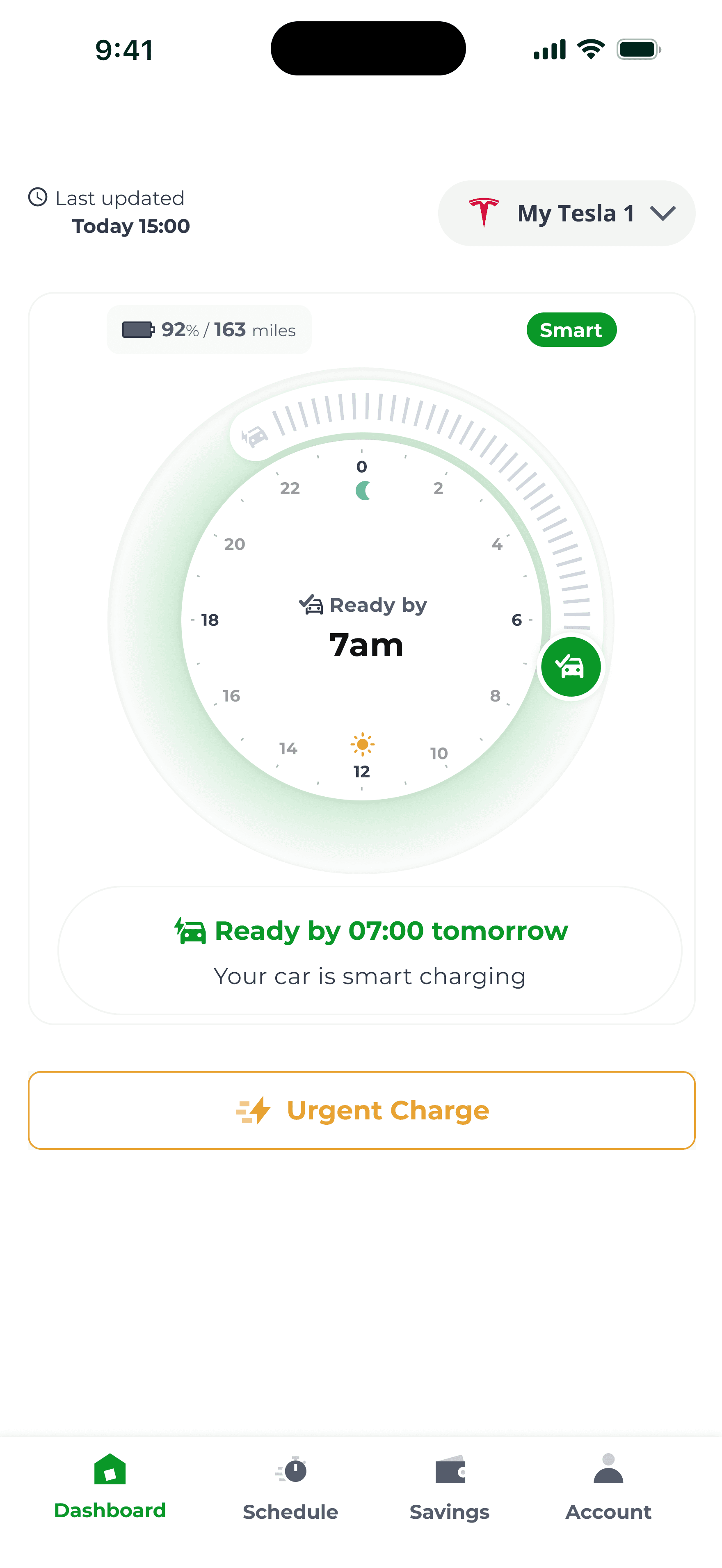
For home users the old screen was static and confusing. Nobody really knew what was happening with their charge. We rebuilt it from scratch, made it interactive, with clear charging statuses that actually told you what was going on. Validated with moderated user testing. Home users were excited about it. That doesn't happen often enough to take for granted.

How we updated the schedule screen to make it clearer for both legacy and new users
Charging statuses
Ovo Charge - Schedule
Usage
Public and home charging in one place, filterable. Public users got the same view, just richer. Home users got the detailed history they'd been asking for.

Charge Anytime

Bonnet
Ovo Charge - Usage
How we updated the usage screen to make it clearer for both legacy and new users
Account
Kept as close to Bonnet as possible. We'd done the testing, we were confident. It landed well.
Ovo Charge - Account
We had a tight timeline following the acquisition. In six months we shipped an MVP unifying both apps while getting the core experience right for both user groups. The work isn't finished. But we have the foundation now.