
Simplifying EV Charging Discovery
Project Overview
The map screen is one of the main screens of our app where users can locate their preferred EV public charger. Given the importance of this screen, we aimed to understand our users' needs and pain points with our current solution. Our objective was to create a faster, smoother experience tailored to users' needs, making it easier than ever to find a public charger.
My Role
The map screen is one of the main screens of our app where users can locate their preferred EV public charger. Given the importance of this screen, we aimed to understand our users' needs and pain points with our current solution. Our objective was to create a faster, smoother experience tailored to users' needs, making it easier than ever to find a public charger.
Team
IOS Developers [2]Android Developers [3]Full Stack Developer [1]Product ManagerHead of ProductLead Product Designer / Researcher (me)
Business objectives
- Increase the number of MAUs by improving their search experience.
- Discover additional features that can enhance the user experience.
- Stay competitive by understanding and addressing gaps in our product compared to competitors.
Research
Research Overview
We aimed to understand our users' needs and requirements to enhance our existing map screen, marker bottom sheet, and FAB (Floating Action Button) usage. Our goal was to validate which information was most useful to our users when they were looking for a public charger and identify any information and features that were less valuable.

Comparative Analysis
Research Overview
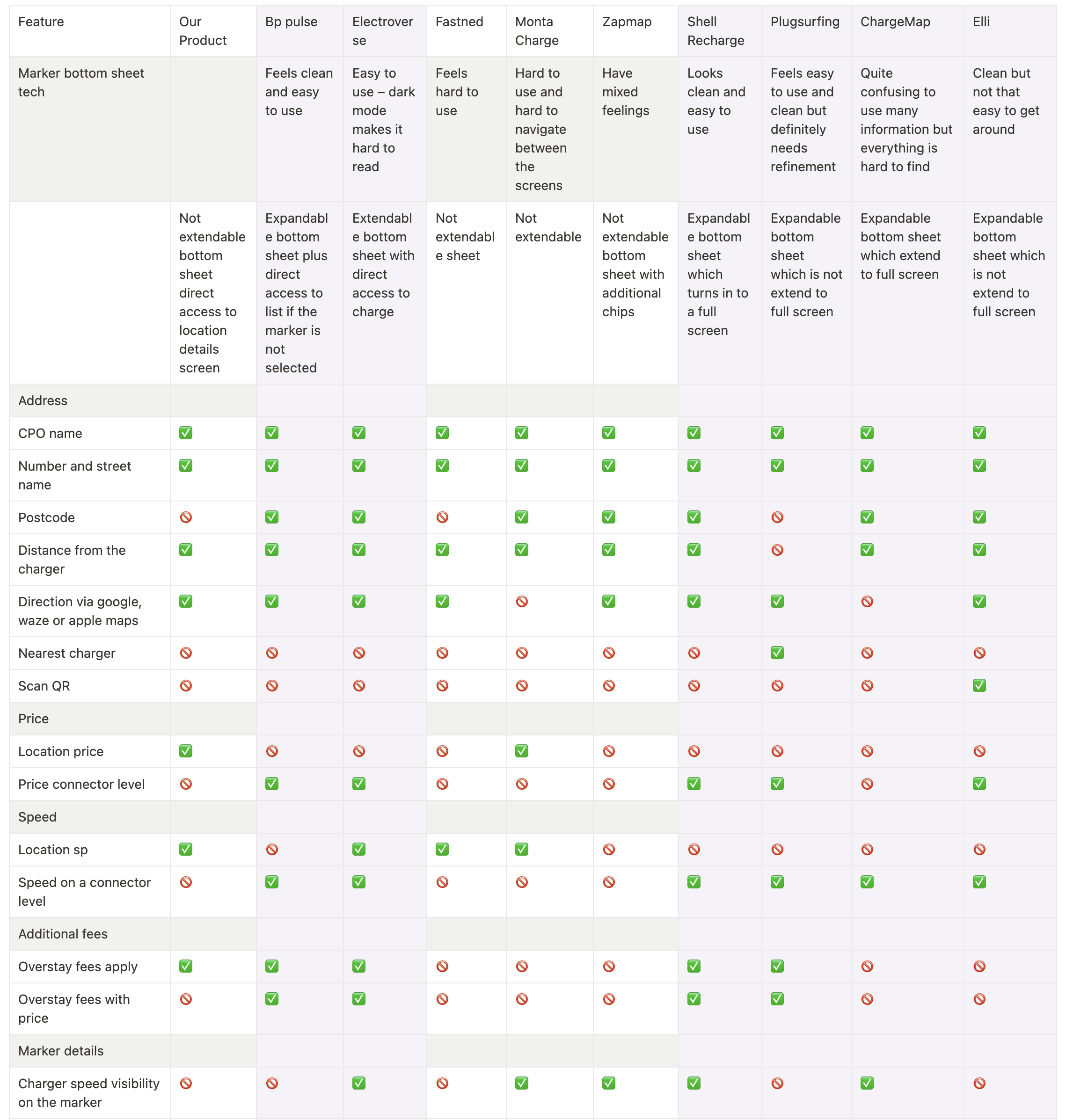
The purpose of this competitive analysis was to gain a comprehensive understanding of the market landscape, identify key competitors, and evaluate their strengths and weaknesses in comparison to our product. By analysing these competitors, we aimed to uncover insights that would inform our strategic decisions, enhance our product offerings, and improve our overall market positioning. This analysis focused on the marker bottom sheet functionality.
Methodology
- Research Methods: Comparative analysis, feature comparison, user reviews, and market reports.
- Data Sources: Competitor websites, competitor apps, user feedback, industry publications.
Competitor Profiles
- Zapmap: Known for detailed location data and nearest charger feature.
- Shell Recharge: Offers full-screen bottom sheet expansions.
- ChargeMap: Provides comprehensive location details.
- BP Pulse: Includes postcode information, connector-level pricing, and speed.
- Electroverse: Similar to BP Pulse with detailed charger information.
Competitive Analyses Notion Document – 2024
Key findings
- Competitor Strengths: Zapmap’s nearest charger feature, BP Pulse’s comprehensive pricing and speed details, and Electroverse’s detailed charger information.
- Our Weaknesses: Lack of postcode information, limited bottom sheet functionality, absence of connector-level details, and insufficient customer care and user engagement features.
- Market Gaps: Connector-Level Details: Adding detailed pricing and speed can attract more informed users.Customer Care and User Features: Enhancing user support and engagement features can build trust and loyalty.
Marker Bottom Sheet Survey
Research Overview
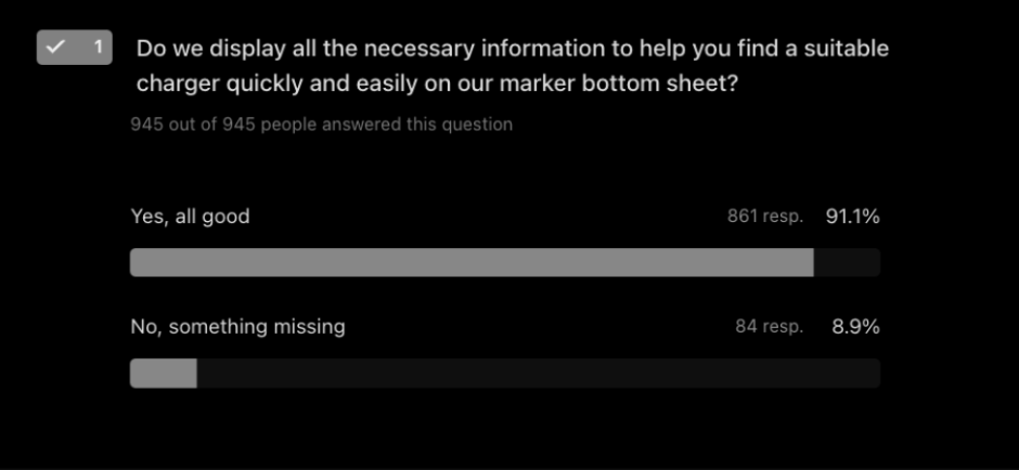
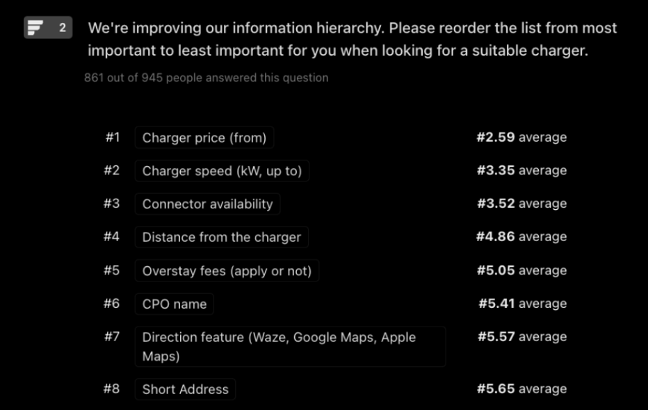
The survey aimed to understand the marker bottom sheet usage by asking users three main questions. The first question checked if the current sheet displayed all necessary information. The second question identified any non-useful information. The third question determines the benefit of displaying postcode information.
Key findings
- Information Sufficiency: 91% found the current information good as it is; only 9% felt some information was missing.
- Reorder Hierarchy: Users who were satisfied with the information provided insights on their preferred hierarchy of the information.
- Additional Information: Small amount of users emphasised the importance of busy time graphs and price graphs for finding suitable chargers.
List View Survey
Research Overview
We aimed to understand user preferences for using map markers versus the charger list view to find a suitable public charger, including the specific information they seek and their focuses to understand feature uses like "Recent" and "Favourite" chargers.
Key findings
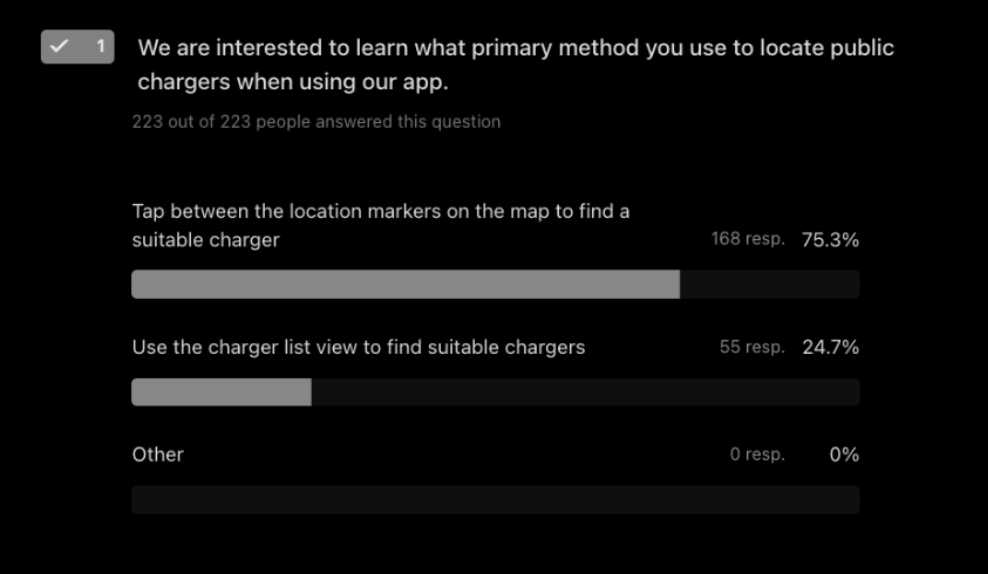
- User Preferences: 74% preferred tapping between markers, while 26% used the list view feature to find a suitable charger.
- Information Sought: Users primarily sought price, availability, and location information.
- Ease of Use: Users found tapping between markers easier and better for visualising locations.
- List View Usage: 63% had not used the list view before; among those who had, the recent charge feature was most used.
Google Analytics Findings
Usage Data: From 28,815 users who visited the MapView, 1,118 visited the LocationListView, making it the 6th most visited screen.
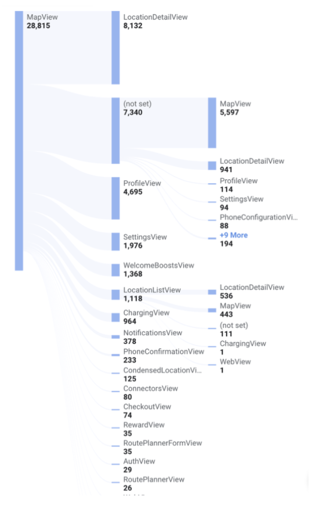
Popular Actions: Filters and search functionalities were more used than the list view.apply_filters: 5.7ksearch_address: 3.4knavigation_notification_button_selected: 1.7kLocationListView: 1.1kRoutePlanner: 60
User Challenges and Pain Points
Overview
Based on our previous research and user feedback, we identified five key pain points with our current solutions.
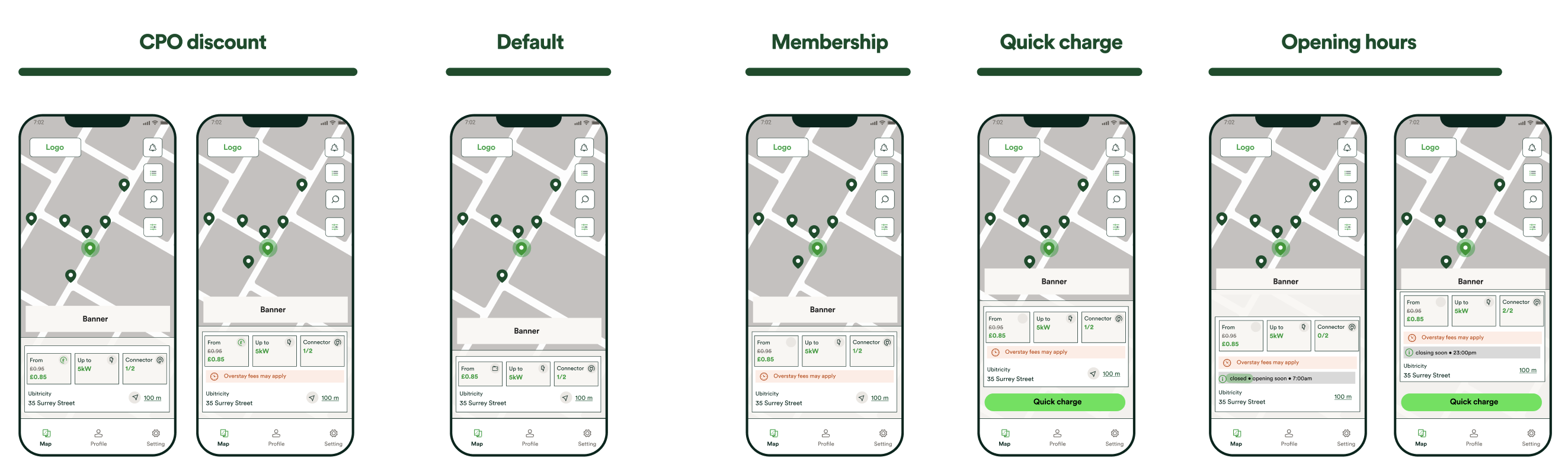
Suboptimal Information Hierarchy and Display
The current charger information hierarchy on the marker bottom sheet may not be user-friendly, hindering the user's ability to quickly find relevant information.
- Goal: Reorganise the charger information on the screen to align with user needs and preferences, making it more intuitive and accessible.
- Potential Solution: Restructure and reorder our current information on the marker card based on the user feedback, by focusing on price, speed and availability.
Wireframes
Validation
Team: Presented the research findings and potential technical solutions to the engineering team. Thoroughly covered all existing variations of the component. We agreed on implementing an animation improvement for the bottom sheet to enhance user engagement and make the component feel more modern and fluid.
Next Step
- Implement Event Tracking: Bottom sheet display: track how much time users spend on the bottom sheet.
- Conduct A/B Testing: User Preferences: Test variations of the information layout to determine which version users find most intuitive and useful. Run a SUS survey to get general user feedback.
- Engagement Metrics: Compare engagement metrics between the new and old designs to assess the impact of the changes.
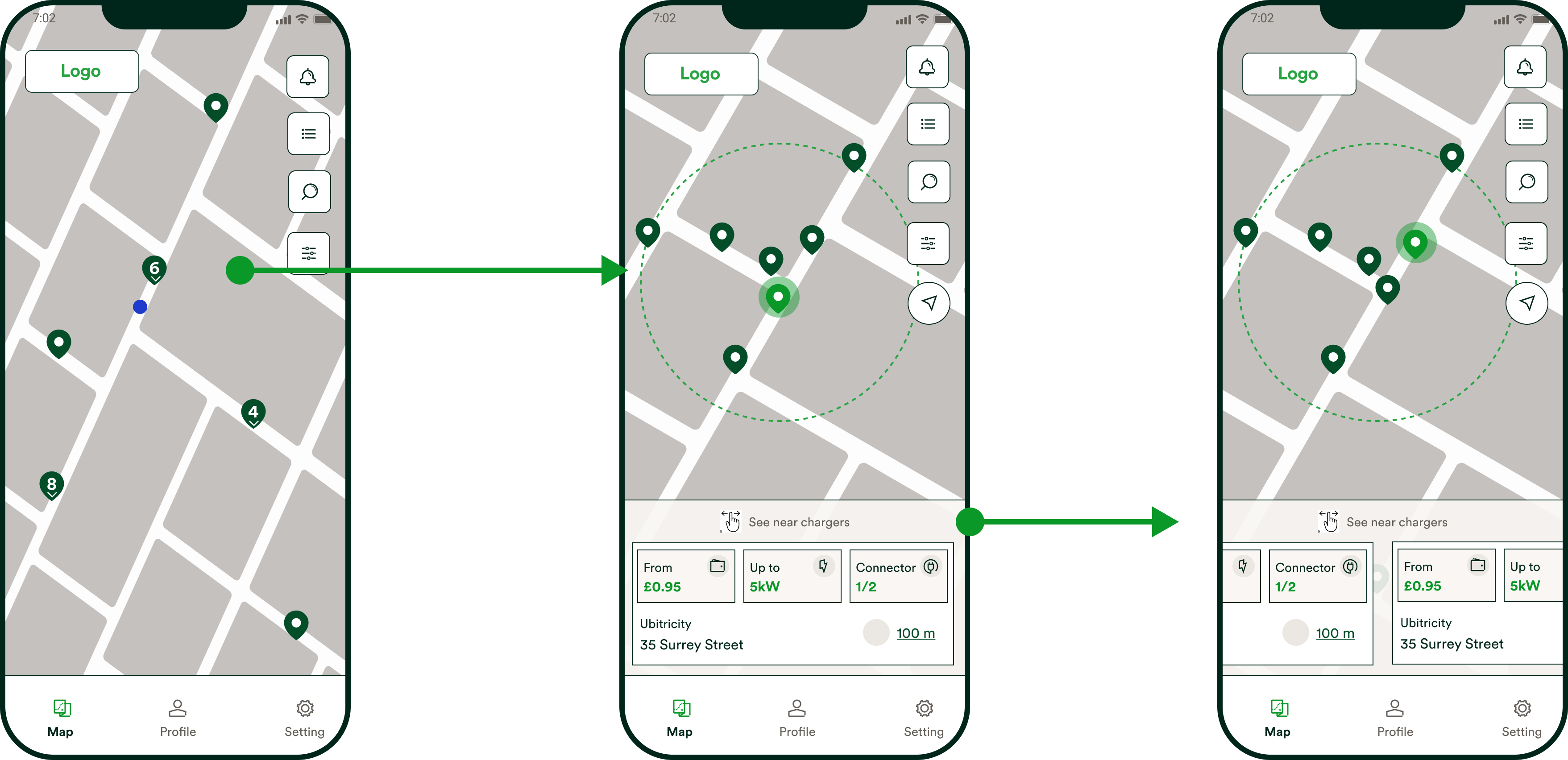
Difficult Finding and Comparing Public Chargers
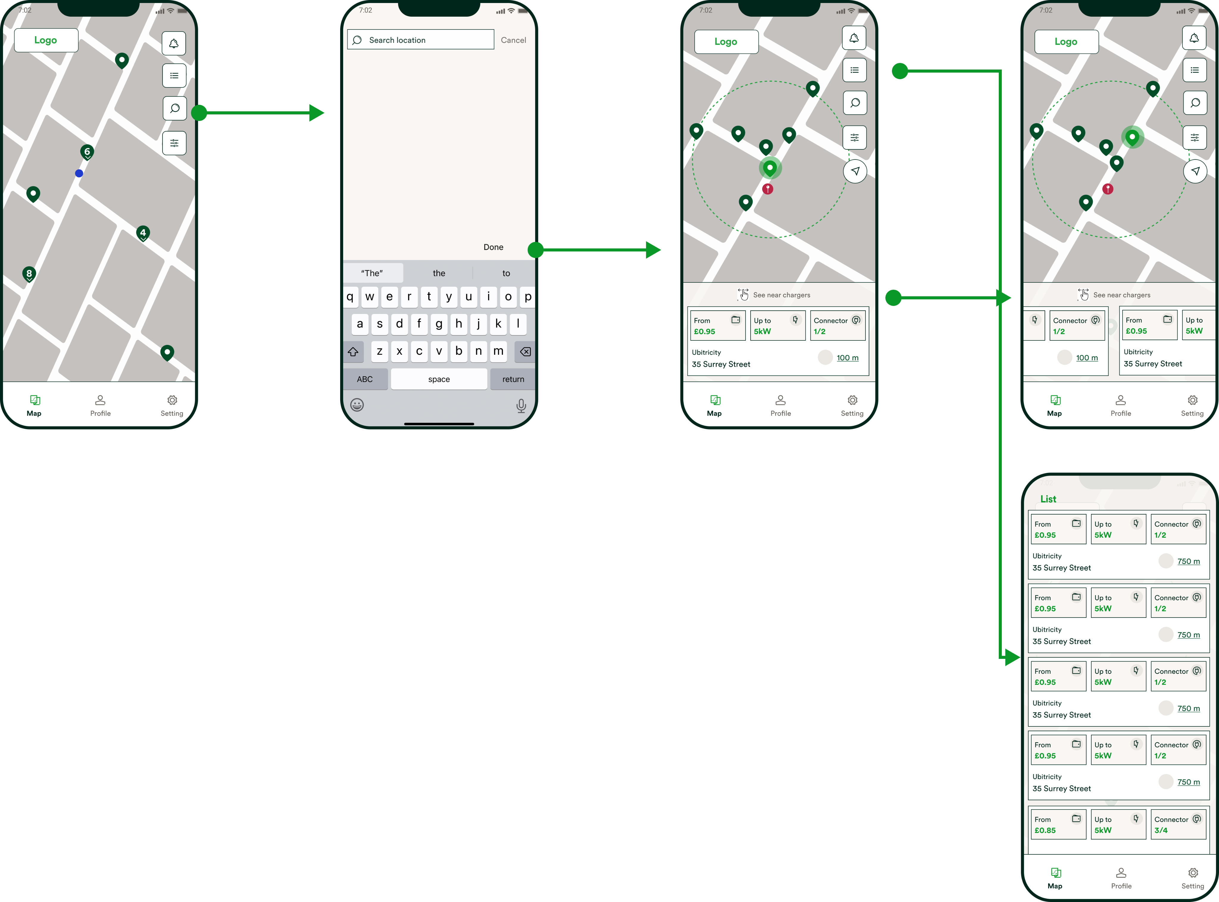
Users face difficulty finding the right public charger as they often need to tap between markers to gather crucial information about the chargers and their locations. Our data reveals that this user flow is cumbersome and inefficient, with users repeatedly switching between the map and the location details screen.
- Goal: Streamline the process of finding the right charger by making it easier for users to access all necessary information without excessive navigation.
- Potential Solution: We are introducing a new functionality for the search feature. When a user searches for a specific address, the closest charger will automatically be displayed on a bottom sheet. To enhance user satisfaction, we will show the nearest chargers on the map and enable swipe actions between marker cards on the bottom sheet. This solution ensures users can see the charger locations on the map in real-time while easily swiping between the marker cards.
Wireframes
Validation
Team: Presented the research findings and potential technical solutions to the engineering team. Together, we refined these solutions, setting backend specifics such as the distance and the number of charger markers shown near the searched address. We agreed on the following:
- Display chargers within a 2km radius of the searched location here users able to swipe between locations.
- If no chargers are found within the 2 km radius, show the closest 6 chargers instead.
Users: Conducted a user survey presenting low-fidelity wireframes of this solution to active users of our app. Results showed that 89% of users felt this solution would significantly improve their experience in locating public chargers.
Next Step
- Analyse: User Satisfaction: Track the Customer Effort Score (CES) monthly to ensure continued improvement user satisfaction with the search flow.
- Implement Event Tracking:
- Search Event: Track each time a user initiates a search.
- Bottom Sheet Display: Track when the swipe able bottom sheet card is displayed.
- Map Interaction: Track all user interactions with the map after the bottom sheet is displayed.
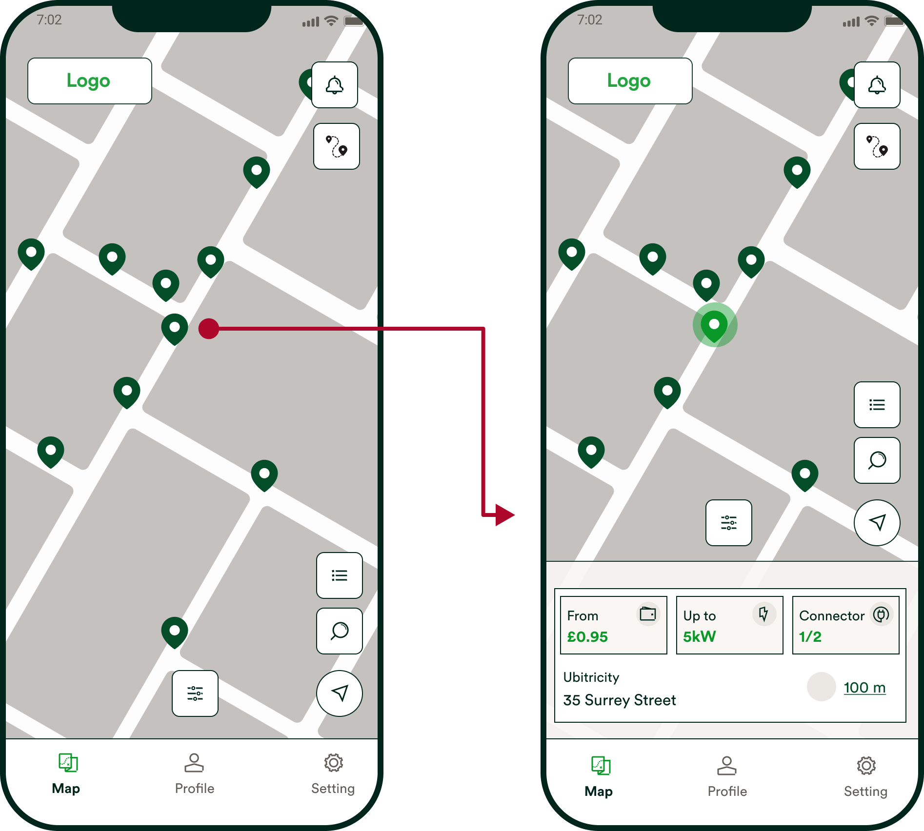
User Frustration with Charger Clustering
Our users experience great annoyance when trying to open our current clusters on the map. They either need to tap multiple times, which takes a lot of time and effort, or use the zoom-in gesture to see the markers separately. This causes a lack of visibility of chargers and their statuses, making the search for chargers inefficient and time-consuming.
- Goal: Streamline the process of finding the right charger by making it easier for users to access all necessary information without excessive navigation.
- Potential Solution: Enable users to open clusters with a single tap. Display the hidden markers on a marker bottom sheet, allowing users to swipe between markers and see real-time correspondences to the map markers for better visibility of their locations. This will enhance visibility and efficiency in locating chargers.
Wireframes
Validation
Team: Presented the research findings and potential technical solutions to the engineering team. Together, we decided that using the same technical solution as we did on the search feature would make this feature more powerful and easier to use for our users.
Users: Conducted a user survey presenting low-fidelity wireframes of this solution to active users of our app. Results showed that 81% of users felt this solution would significantly improve their experience in locating public chargers.
Next Step
- Analyse: User Satisfaction: Track the Customer Effort Score (CES) monthly to ensure continued improvement user satisfaction with the search flow.
- Google Analytics:
- Time to Open Clusters: Track each time a user initiates a search. Average time taken by users to open a cluster and access individual markers.
- Performance Metrics: App performance metrics such as load times and responsiveness when interacting with clusters.
Overwhelming Map
Users find our map overwhelming and cluttered with irrelevant information, leading to significant frustration when interacting with our markers.
- Goal: Enhance the user experience by eliminating unnecessary landmarks and ensuring the map displays only essential information. This will make it easier for users to read and interact with the map without interference from irrelevant detail.
- Potential Solution: Remove all points of interest from the map and adjust the map to follow a standard map style. It is an easy setting change which the team can implement fairly quickly.
Next Step
- Analyse: User Satisfaction: Track the Customer Effort Score (CES) monthly to ensure continued improvement user satisfaction with the map.
Hiding FABs When Viewing Chargers on the Map
Currently, when the marker bottom sheet is open (after a user taps on the charger marker), crucial FABs such as filter, exact location, and route planner are hidden under the marker bottom sheet. This leads to numerous user requests for the filter feature, which we already have.
- Goal: Ensure that the FABs are visible at all times on the map, making it easier for users to find and use the FABs such as filters.
- Potential Solution: Adjust placing of FABs: Reposition FABs on the map screen to ensure full visibility at all times on the screen by moving them on top of the screen and middle of the screen. This is a decent solution, but the only negative aspect is slightly harder access for users due to the positioning of the FABs.
Wireframes
Validation
Team: Based on time constraints, we decided to roll out the first option for IOS. We will monitor the increase in the adoption of filters and closely observe user feedback from our CES monthly report. If we still receive negative comments on user confusion we will do further research and potentially roll out the second option.
Next Step
- Analyse User Satisfaction: Track the Customer Effort Score (CES) monthly to ensure continued improvement in user satisfaction with the FAB placement.
- Google Analytics:
- FAB Usage: Track each time a user interacts with the FABs. Measure the frequency and ease of use of the newly positioned FABs.
- Performance Metrics: Monitor app performance metrics to ensure that the new FAB positions do not negatively impact the overall user experience.
Simplifying EV Charging Discovery
Project Overview
The map screen is one of the main screens of our app where users can locate their preferred EV public charger. Given the importance of this screen, we aimed to understand our users' needs and pain points with our current solution. Our objective was to create a faster, smoother experience tailored to users' needs, making it easier than ever to find a public charger.
My Role
The map screen is one of the main screens of our app where users can locate their preferred EV public charger. Given the importance of this screen, we aimed to understand our users' needs and pain points with our current solution. Our objective was to create a faster, smoother experience tailored to users' needs, making it easier than ever to find a public charger.
Team
IOS Developers [2]Android Developers [3]Full Stack Developer [1]Product ManagerHead of ProductLead Product Designer / Researcher (me)
Business objectives
- Increase the number of MAUs by improving their search experience.
- Discover additional features that can enhance the user experience.
- Stay competitive by understanding and addressing gaps in our product compared to competitors.
Research
Research Overview
We aimed to understand our users' needs and requirements to enhance our existing map screen, marker bottom sheet, and FAB (Floating Action Button) usage. Our goal was to validate which information was most useful to our users when they were looking for a public charger and identify any information and features that were less valuable.

Comparative Analysis
Research Overview
The purpose of this competitive analysis was to gain a comprehensive understanding of the market landscape, identify key competitors, and evaluate their strengths and weaknesses in comparison to our product. By analysing these competitors, we aimed to uncover insights that would inform our strategic decisions, enhance our product offerings, and improve our overall market positioning. This analysis focused on the marker bottom sheet functionality.
Methodology
- Research Methods: Comparative analysis, feature comparison, user reviews, and market reports.
- Data Sources: Competitor websites, competitor apps, user feedback, industry publications.
Competitor Profiles
- Zapmap: Known for detailed location data and nearest charger feature.
- Shell Recharge: Offers full-screen bottom sheet expansions.
- ChargeMap: Provides comprehensive location details.
- BP Pulse: Includes postcode information, connector-level pricing, and speed.
- Electroverse: Similar to BP Pulse with detailed charger information.
Competitive Analyses Notion Document – 2024
Key findings
- Competitor Strengths: Zapmap’s nearest charger feature, BP Pulse’s comprehensive pricing and speed details, and Electroverse’s detailed charger information.
- Our Weaknesses: Lack of postcode information, limited bottom sheet functionality, absence of connector-level details, and insufficient customer care and user engagement features.
- Market Gaps: Connector-Level Details: Adding detailed pricing and speed can attract more informed users.Customer Care and User Features: Enhancing user support and engagement features can build trust and loyalty.
Marker Bottom Sheet Survey
Research Overview
The survey aimed to understand the marker bottom sheet usage by asking users three main questions. The first question checked if the current sheet displayed all necessary information. The second question identified any non-useful information. The third question determines the benefit of displaying postcode information.
Key findings
- Information Sufficiency: 91% found the current information good as it is; only 9% felt some information was missing.
- Reorder Hierarchy: Users who were satisfied with the information provided insights on their preferred hierarchy of the information.
- Additional Information: Small amount of users emphasised the importance of busy time graphs and price graphs for finding suitable chargers.
List View Survey
Research Overview
We aimed to understand user preferences for using map markers versus the charger list view to find a suitable public charger, including the specific information they seek and their focuses to understand feature uses like "Recent" and "Favourite" chargers.
Key findings
- User Preferences: 74% preferred tapping between markers, while 26% used the list view feature to find a suitable charger.
- Information Sought: Users primarily sought price, availability, and location information.
- Ease of Use: Users found tapping between markers easier and better for visualising locations.
- List View Usage: 63% had not used the list view before; among those who had, the recent charge feature was most used.
Google Analytics Findings
Usage Data: From 28,815 users who visited the MapView, 1,118 visited the LocationListView, making it the 6th most visited screen.
Popular Actions: Filters and search functionalities were more used than the list view.apply_filters: 5.7ksearch_address: 3.4knavigation_notification_button_selected: 1.7kLocationListView: 1.1kRoutePlanner: 60
User Challenges and Pain Points
Overview
Based on our previous research and user feedback, we identified five key pain points with our current solutions.
Suboptimal Information Hierarchy and Display
The current charger information hierarchy on the marker bottom sheet may not be user-friendly, hindering the user's ability to quickly find relevant information.
- Goal: Reorganise the charger information on the screen to align with user needs and preferences, making it more intuitive and accessible.
- Potential Solution: Restructure and reorder our current information on the marker card based on the user feedback, by focusing on price, speed and availability.
Wireframes
Validation
Team: Presented the research findings and potential technical solutions to the engineering team. Thoroughly covered all existing variations of the component. We agreed on implementing an animation improvement for the bottom sheet to enhance user engagement and make the component feel more modern and fluid.
Next Step
- Implement Event Tracking: Bottom sheet display: track how much time users spend on the bottom sheet.
- Conduct A/B Testing: User Preferences: Test variations of the information layout to determine which version users find most intuitive and useful. Run a SUS survey to get general user feedback.
- Engagement Metrics: Compare engagement metrics between the new and old designs to assess the impact of the changes.
Difficult Finding and Comparing Public Chargers
Users face difficulty finding the right public charger as they often need to tap between markers to gather crucial information about the chargers and their locations. Our data reveals that this user flow is cumbersome and inefficient, with users repeatedly switching between the map and the location details screen.
- Goal: Streamline the process of finding the right charger by making it easier for users to access all necessary information without excessive navigation.
- Potential Solution: We are introducing a new functionality for the search feature. When a user searches for a specific address, the closest charger will automatically be displayed on a bottom sheet. To enhance user satisfaction, we will show the nearest chargers on the map and enable swipe actions between marker cards on the bottom sheet. This solution ensures users can see the charger locations on the map in real-time while easily swiping between the marker cards.
Wireframes
Validation
Team: Presented the research findings and potential technical solutions to the engineering team. Together, we refined these solutions, setting backend specifics such as the distance and the number of charger markers shown near the searched address. We agreed on the following:
- Display chargers within a 2km radius of the searched location here users able to swipe between locations.
- If no chargers are found within the 2 km radius, show the closest 6 chargers instead.
Users: Conducted a user survey presenting low-fidelity wireframes of this solution to active users of our app. Results showed that 89% of users felt this solution would significantly improve their experience in locating public chargers.
Next Step
- Analyse: User Satisfaction: Track the Customer Effort Score (CES) monthly to ensure continued improvement user satisfaction with the search flow.
- Implement Event Tracking:
- Search Event: Track each time a user initiates a search.
- Bottom Sheet Display: Track when the swipe able bottom sheet card is displayed.
- Map Interaction: Track all user interactions with the map after the bottom sheet is displayed.
User Frustration with Charger Clustering
Our users experience great annoyance when trying to open our current clusters on the map. They either need to tap multiple times, which takes a lot of time and effort, or use the zoom-in gesture to see the markers separately. This causes a lack of visibility of chargers and their statuses, making the search for chargers inefficient and time-consuming.
- Goal: Streamline the process of finding the right charger by making it easier for users to access all necessary information without excessive navigation.
- Potential Solution: Enable users to open clusters with a single tap. Display the hidden markers on a marker bottom sheet, allowing users to swipe between markers and see real-time correspondences to the map markers for better visibility of their locations. This will enhance visibility and efficiency in locating chargers.
Wireframes
Validation
Team: Presented the research findings and potential technical solutions to the engineering team. Together, we decided that using the same technical solution as we did on the search feature would make this feature more powerful and easier to use for our users.
Users: Conducted a user survey presenting low-fidelity wireframes of this solution to active users of our app. Results showed that 81% of users felt this solution would significantly improve their experience in locating public chargers.
Next Step
- Analyse: User Satisfaction: Track the Customer Effort Score (CES) monthly to ensure continued improvement user satisfaction with the search flow.
- Google Analytics:
- Time to Open Clusters: Track each time a user initiates a search. Average time taken by users to open a cluster and access individual markers.
- Performance Metrics: App performance metrics such as load times and responsiveness when interacting with clusters.
Overwhelming Map
Users find our map overwhelming and cluttered with irrelevant information, leading to significant frustration when interacting with our markers.
- Goal: Enhance the user experience by eliminating unnecessary landmarks and ensuring the map displays only essential information. This will make it easier for users to read and interact with the map without interference from irrelevant detail.
- Potential Solution: Remove all points of interest from the map and adjust the map to follow a standard map style. It is an easy setting change which the team can implement fairly quickly.
Next Step
- Analyse: User Satisfaction: Track the Customer Effort Score (CES) monthly to ensure continued improvement user satisfaction with the map.
Hiding FABs When Viewing Chargers on the Map
Currently, when the marker bottom sheet is open (after a user taps on the charger marker), crucial FABs such as filter, exact location, and route planner are hidden under the marker bottom sheet. This leads to numerous user requests for the filter feature, which we already have.
- Goal: Ensure that the FABs are visible at all times on the map, making it easier for users to find and use the FABs such as filters.
- Potential Solution: Adjust placing of FABs: Reposition FABs on the map screen to ensure full visibility at all times on the screen by moving them on top of the screen and middle of the screen. This is a decent solution, but the only negative aspect is slightly harder access for users due to the positioning of the FABs.
Wireframes
Validation
Team: Based on time constraints, we decided to roll out the first option for IOS. We will monitor the increase in the adoption of filters and closely observe user feedback from our CES monthly report. If we still receive negative comments on user confusion we will do further research and potentially roll out the second option.
Next Step
- Analyse User Satisfaction: Track the Customer Effort Score (CES) monthly to ensure continued improvement in user satisfaction with the FAB placement.
- Google Analytics:
- FAB Usage: Track each time a user interacts with the FABs. Measure the frequency and ease of use of the newly positioned FABs.
- Performance Metrics: Monitor app performance metrics to ensure that the new FAB positions do not negatively impact the overall user experience.